Reid Stockfeeds leads the way with Trusted Performance
Client: Reid Stockfeeds
Project: Brand Identity, Design & Marketing, Fleet Livery & Signage, Uniforms, Digital Marketing, Social Media, Advertising, HR Services
Sector: Agriculture
The Objective
To identify the strengths and weaknesses of the Reid Stockfeeds brand against its competitors and to provide clear recommendations to empower the brand moving forwards.
Sounds simple enough, but as Reid Stockfeeds is an established family business with a 37 year history in producing quality stockfeed, the brand comes with great “emotional” attachment to the owners, staff and community. The current logo was originally designed for one main purpose; to work really well on truck and trailer, which it did for 20 years. It was not designed for today’s digital age, the brand positioning was not clear and the marketing was no longer totally relevant. It needed to evolve to remain competitive against highly organised competition.
The Solution
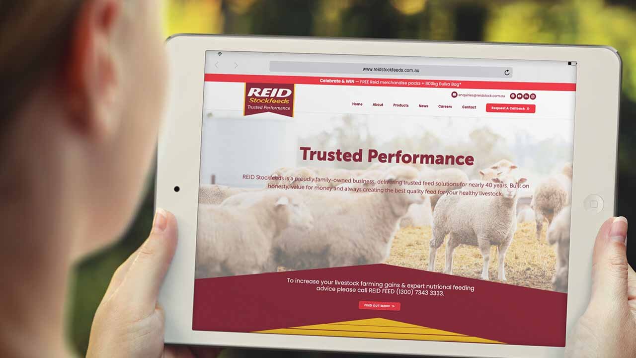
Before you can move forwards you need to understand the best position to defend, so an in-depth brand audit of the Reid Stockfeeds’ brand was undertaken to assess all the key competitors’ brands, marketing messages, touch-points, social channels, product packaging and customer research. Once distilled, Dovetail was able to build a very clear understanding of where “Reids” ranked within its category; what positions the competitors have taken and more importantly what positions were available. We found all the competitors are fighting over “performance, leading and potential” and that the answer was already part of the Reid’s DNA - a critical value that embodies everything Reid’s does, but that was absent from the competition. “Trust” was the key, a very powerful brand position that resonates deeply with customers and employees and so “Trusted Performance” was born.
With the positioning secured, the focus shifted to the logo or brand mark. A 20 year old logo accrues a lot of familiarity which can be a challenge, as the new logo needs to respect the origins of previous evolution. It also needs to be one that can adapt smarter across print, digital and sales environments and resonate with loyal customers and employees alike.
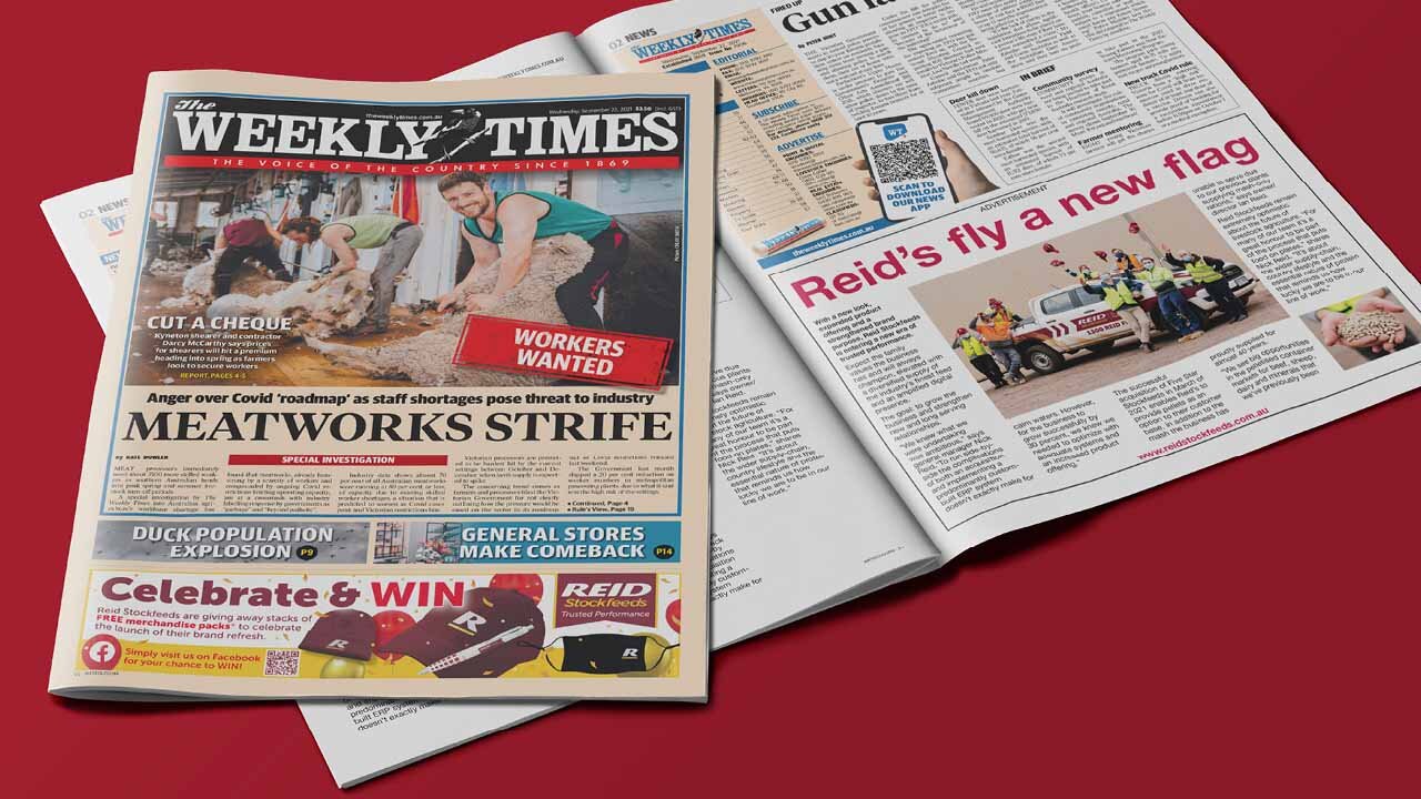
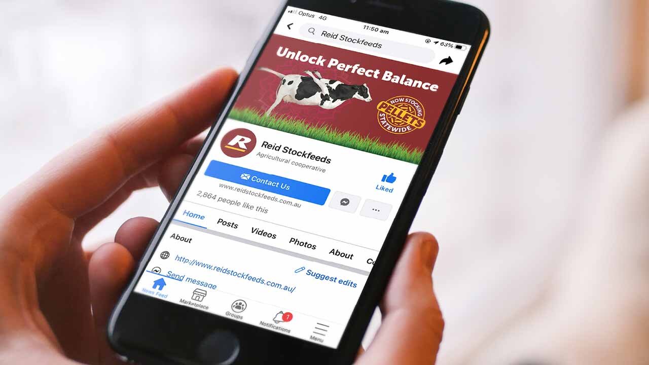
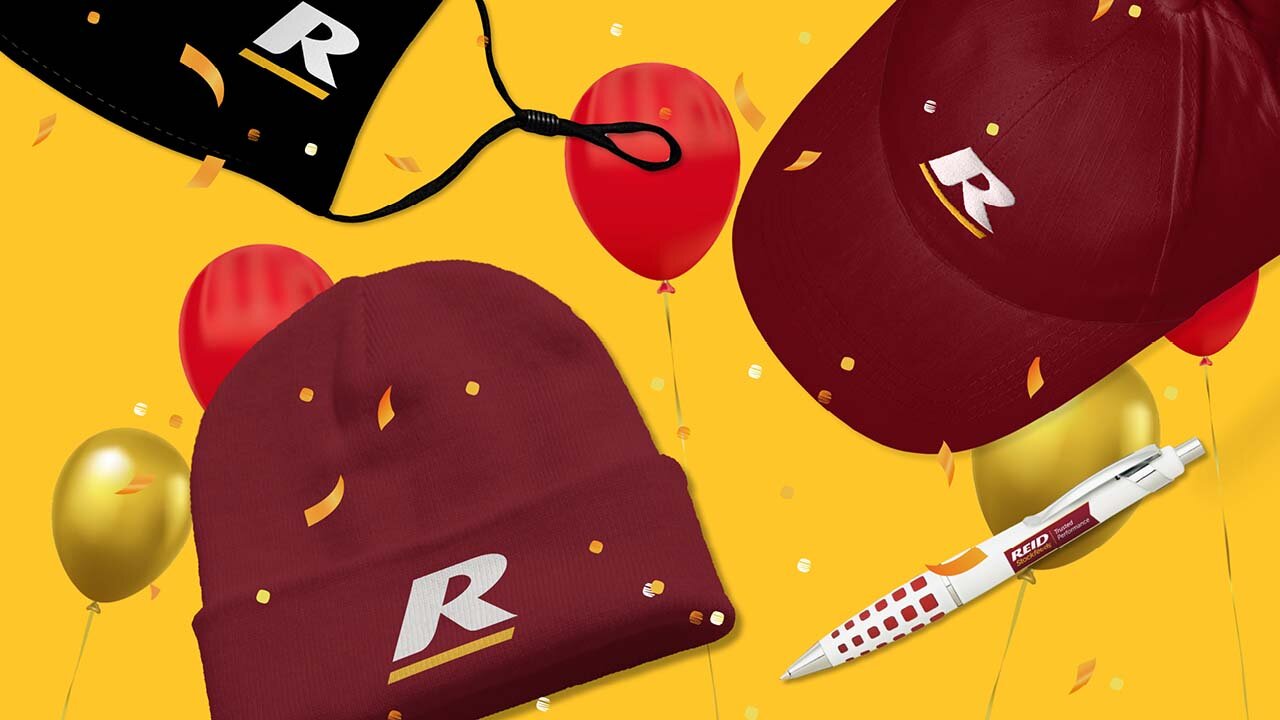
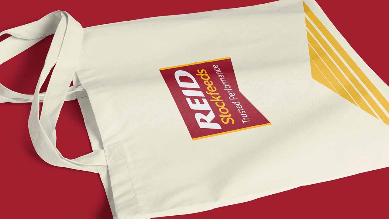
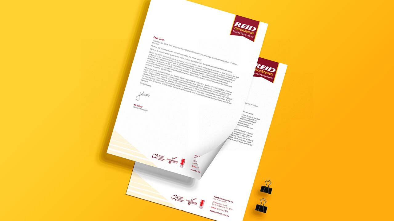
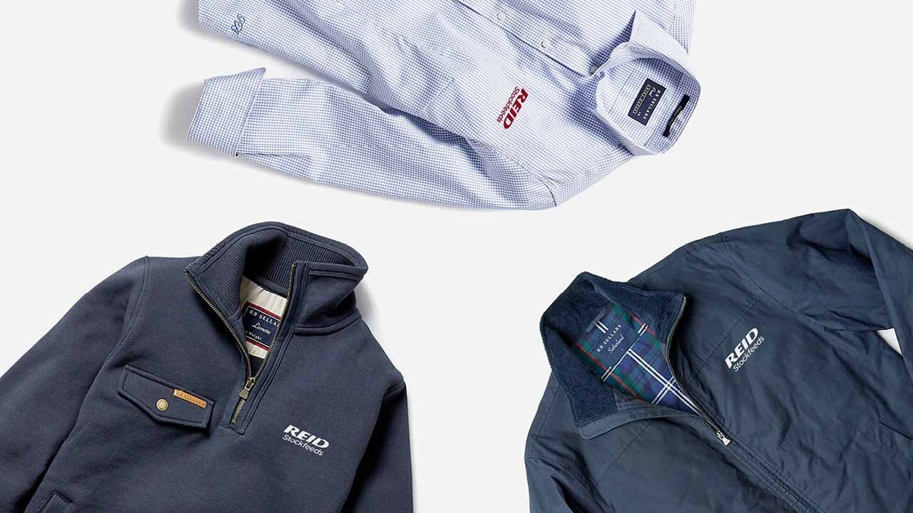
The solution was to empower the REID’s name so it was more pronounced and dominant within the brand identity, and also to encapsulate it with a ribbon or flag structure that can sit above any REID retail product brand on the shop floor, OR wrap around a service UTE or giant haulage truck with ease. Keeping the burgundy and golden yellow colours, the flag embodies the energy of the earlier stripes, but now defined they give flexibility and greater legibility in any marketing application. Less is always more, so for social application and promotional wear a simple “R” avatar was created so the brand can be instantly recognised across social channels and staff and customers can wear some great corporate gear that does not feel like corporate gear, meaning greater acceptance and wearability.
The Outcome
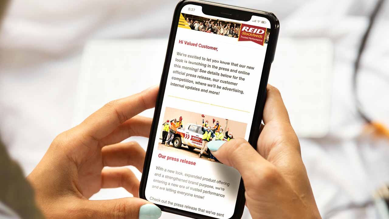
The new REID brand has been widely accepted by customers and employees alike, with an overwhelming positive response even from the few that initially felt a brand refresh was not required. The REID brand is now “best” positioned to grow and thrive against its competitors, with the team unifying as one behind the brand and with clear marketing messages to create new growth, internally and externally.
“Dovetail and HRplus have been instrumental in our 5-year strategy that includes a strong theme for improving our communications both internally and externally. The link between HR and Marketing is fundamental in achieving these outcomes. Aside from this, their responsiveness and ability to turn around projects has truly been beyond expectation.”
Dovetail Brand Engagement are branding agency based in Melbourne and Perth, who are also experts in Human Resources. They combine and align the power of both “brand and culture” to transform Australian & International businesses to the next level. If you would like to find out more about how we could “redefine your brand” please click here.
